Most everyday web users can’t tell you what elements you need in a website to make it appealing to your target audience. When they are using a website, they just know that it feels right and that they can trust this company. That should be the goal of every website, make the user trust you and your product or service.
Your user is definitely judging your business by its website. With 48% of people citing a website’s design as the number one factor in deciding the credibility of a business, you can’t afford to make a bad impression. But having a pretty, updated, and modern website doesn’t automatically warrant a conversion or action from a user, it is just the beginning.
At Kodeak, there is so much more that goes into your web design that will get you new business than making it look pretty. We believe that your website is a marketing platform. A place that you want to direct all of your online marketing efforts toward for the best conversion potential through your Tucson SEO or internet marketing campaign.
So what are the key elements to have for good web design and conversion?
Glad you asked. Here are 4 key points that we consider on every website build with some real Kodeak case studies and some of the clients that we helped increase their business by implementing these things.

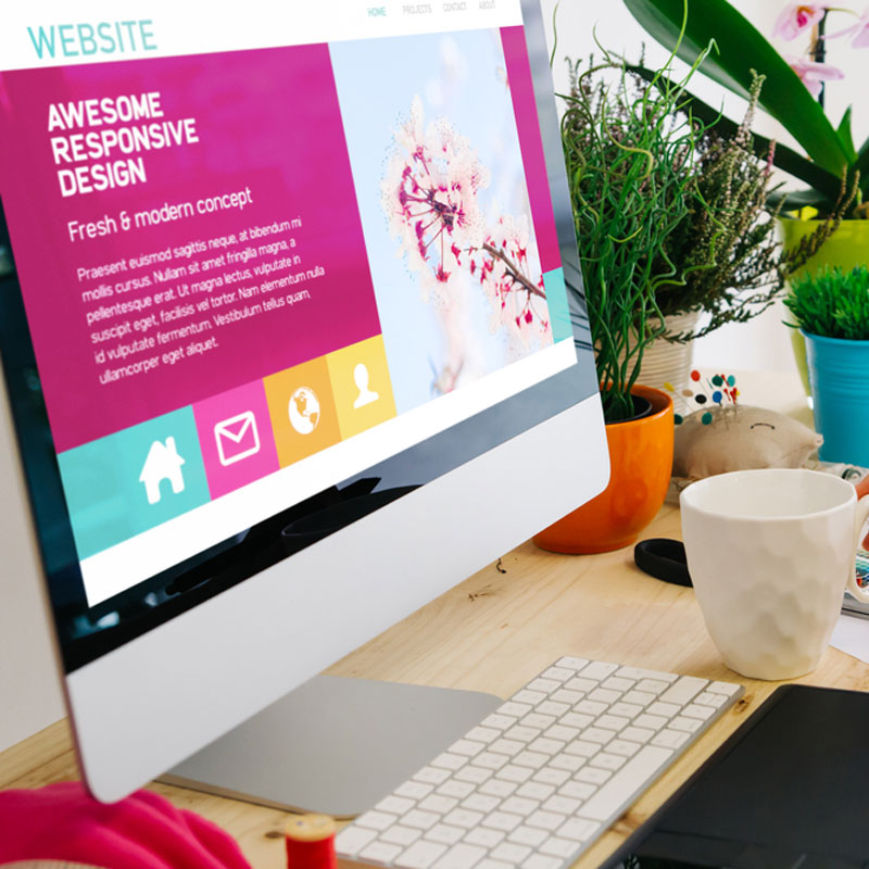
Visuals / Media
There is no secret that the majority of people retain more visual information over text or audio information. Let’s start with some facts:
- On average, people retain 80% of what they see and only 20% of what they read
- Visuals are processed 600,000 times faster than text
- 90% of information sent to the brain is visual
- Web content with visuals gets 94% more total views than content without
- The average user reads only 20% of the text on a regular webpage
Images create emotion and emotion is typically what drives action, and the right image can really inspire a user to give you their lead. For example, one of our clients, DSA Vacations for example.
CASE STUDY #1
DSA Vacations is an international travel agency specializing in packaged vacations to Africa, South America, and Asia. We partnered with them to take over their Google PPC marketing. Right off the bat, we found a number of things that could be improved with their account, but the main variable was their landing pages for their ads. They were too bland with a lot of text and really lacked anything that got us excited about booking a trip with them.

We wanted to get their users excited about booking a once in a lifetime experience and adventure. I mean, the user is searching for this because they want to see the sights, why not start now. By adding colorful and vibrant images like the ones above, the conversion on their landing page form went from less than 5% to over 15% overnight. In fact, in a conference call with Google’s marketing team and our client, they said the bounce rate we accomplished for our client of 11.14% for the month reviewed on the landing pages was “amazing”.
Testimonials / Reviews
Google is looking for 3 key pieces on every web page that determine where a web page will fall on the search engine results pages for any given search; Expertise, Authority, and Trust. And that is because your users are looking for the same thing. Your website should be able to prove your expertise and authority through its content and accreditations and trust should be built with those elements along with third-party reviews. We like to place these reviews right before a call to action in most cases, but with Blue Coyote Painting in Tucson, AZ, we took it one step further.
CASE STUDY #2
Blue Coyote Painting is a Tucson & Phoenix residential and commercial painting company. They came to us with a very outdated website that was not converting traffic as well as they felt it should be. After updating the website with a much cleaner and appealing look and better flow and call to action, not only do they have more conversion, but they are also getting more traffic. And that traffic is staying on-site longer, viewing more pages, and really interacting with their new Tucson web design. We accredit the 2.5X increase in conversion through the website to how we were able to make the user trust Blue Coyote for their painting needs quicker than their old website.

We have testimonials/reviews placed throughout the pages of the website, but we really wanted to wow the user with these third-party recommendations right when they entered the website. The first element that you see when you open the homepage is a big background image that makes it obvious that this company does painting along with scrolling testimonials from previous clients. Then right when you scroll is a welcome message and a call to action directing the user to interact with the site.
Call to Action
Every user that finds your website is in search of information. Whether it is about a service or product that you offer or more information about your organization. This is why they are called “search queries”, the user has a question that needs to be answered. We want to deliver the information they are looking for as efficiently, thoroughly, and effectively as possible, but what next. After the content is consumed and if your website was designed to be a marketing platform, there is usually an opportunity to convert that user into a client/customer/donor.
Call-to-actions can be forms, buy buttons, donate button, call buttons, text button, email links, newsletter/event sign-ups, etc. Anything that helps you make a sale or get a lead. Use the right call to action for your audience too. Below are a few examples of using the right call to action for your user.
CASE STUDY #3

Rubs Massage Studios is a local Tucson/Phoenix massage chain. We partnered with them to optimize their website conversion and to run their Google PPC & internet marketing. We started with the “Book an Appointment” page on their website. There are 3 ways that a user can make or request an appointment: through a request form, a phone call, and a salon booking tool that their developer set them up with. The booking program was the prominently displayed element and was only interacted 1-2 times a month for all locations combined. Under that was the request form, which received a good amount of requests. We believed that the booking tool was too complicated for the user which is why it wasn’t interacted with. We proposed to move that program to the bottom of the page and make the request form and phone numbers front and center above the fold. Once we implemented the change, the conversion skyrocketed 125%, well into the triple digits for the “request an appointment” forms alone.
CASE STUDY #4
For the same client, Rubs Massage, we discovered something interesting about their paid marketing campaign. Since our ad is on average either the first or second spot for anything massage service related in Tucson/Phoenix, we knew that these people who clicked value their time. We found through analytics that these users liked to dial the store of their choice on the phone. We made this very easy through call extensions in the ad and clickable phone numbers in the head of the landing page, above the fold. These are the most interacted with CTAs for the ad campaign now.
CASE STUDY #5

SweetCheeks Wax Parlor is a waxing studio near the University of Arizona campus. Their main demographic is college students. Before we built her website, we found that through her social media, she encouraged texting for appointment requests and that it was a highly used medium for her clients. We took advantage of this and installed a “Send a Text Message” button in the footer of every page. The user can click the button from their mobile device and is immediately taken to their native SMS application, with the SweetCheeks text line already set, to then request an appointment. Since the website launch, the owner has hired more staff and moved into a bigger space in the same complex just to keep up with the demand.
Content Organization
There should always be a flow to a web page. Something that guides a user logically through your content, builds your expertise, authority, and trust with the user, and then gives them an action to perform. We see a lot of websites fall short of this and leaves the user hanging at the end of the page wondering what they should do next. Not everyone will scroll back to the top of the page in search of a way to contact you or buy something, in fact, most won’t. Your site needs to be ready when your user is ready to act. Don’t give them a chance to get confused or lost on your site and potentially bounce without making an action after you have made all that headway with them.
CASE STUDY #6
Arizona Community Surgeons is a group of 9 surgical practices (close to 40 surgeons) that came to us thinking that they needed more traffic to their website. During our standard preliminary investigations and studying the current website analytics of their then-current website, we found that their traffic was actually really good. Their users were just getting lost in the site and confused and ended up going around in circles before bouncing. With their new Kodeak designed website, the user now has just about every piece of information they were searching for on one page followed by obvious call-to-action areas to request an appointment, call, and/or get directions (all clickable for ease of use). Now, there wasn’t any trackable conversion information on this site prior to the new website and there were no fillable forms prior as well, so it’s difficult to tie it to a definitive percentage increase, but the forms are being heavily utilized now.

CASE STUDY #7
Quick Park Quick Shuttle is a company that operates a few parking lots near the Tucson International Airport. The goal of this project was to improve each of their properties rank in Google Maps and get a better return on ad spend through Google AdWords. The original site was also a one-page site, but designed with old SEO tactics and overly-stuffed with keywords. It was essentially unreadable and still not ranking where they wanted it to. We redesigned the webpage to guide the user through the information. Since it is a parking lot that offers one main service, we were able to make that clear, show off the amenities, the options, and then the call to action areas. All traffic is driven to this one page, and with over 1300 monthly sessions, we have accomplished a 33% conversion and a bounce rate of less than 1%. This means that more than 99% of the users are interacting with the page and 1 out of every 3 turns into a lead.
There is more to it than this when creating a successful website and/or marketing campaign of course. This is why before starting any project, we dive into analytics and really drill down on what your users are looking for, what they want to see, and then give it to them. Every business is unique in what they want to accomplish or even how they want to accomplish it. Let us help you decide the best course of action for your business and it’s internet presence to help get you the most conversion for your efforts.